**Strategic Summary:** Information is only an asset if it can be consumed instantly. In this part, we explore the **Visual Ergonomics** of the US Market Analyzer—how to use Next.js and Tailwind CSS to create a premium, low-friction UI designed for professional focus and clarity.
1. The Strategy: Design as a Cognitive Filter
When I sit in front of a market terminal, I don’t want “flashy.” I want Clarity. In high-stakes trading, every millisecond of cognitive load spent deciphering a cluttered UI is a millisecond stolen from critical decision-making.
My vision for the US Market Analyzer frontend was a “Fintech Command Center.” By using Vibe Coding, I was able to direct AI to implement a design system that minimizes eye strain and highlights outliers. We aren’t just building a website; we are building a Sensor Display.
2. Aesthetics for Concentration: The Zinc & Indigo System
We didn’t choose our color palette by accident. We chose it for Endurance.
- Deep Context (`Zinc-950`): Dark mode is not just a trend; for someone staring at charts for 8 hours, it’s a physical necessity. It reduces blue light exposure and makes vibrant data points “pop.”
- Institutional Accents (`Indigo-500`): We used Indigo as our primary action color—a hue that conveys stability and modern professionalism.
- Glassmorphism (The Depth Strategy): By using `backdrop-blur-md` on our cards, we create a clear visual hierarchy. It tells the eye: “This data point is currently active and floating above the noise.”
3. High-Fidelity Visualization: Clarity at Scale
A professional quant needs to see the “Big Picture” and the “Fine Detail” simultaneously.
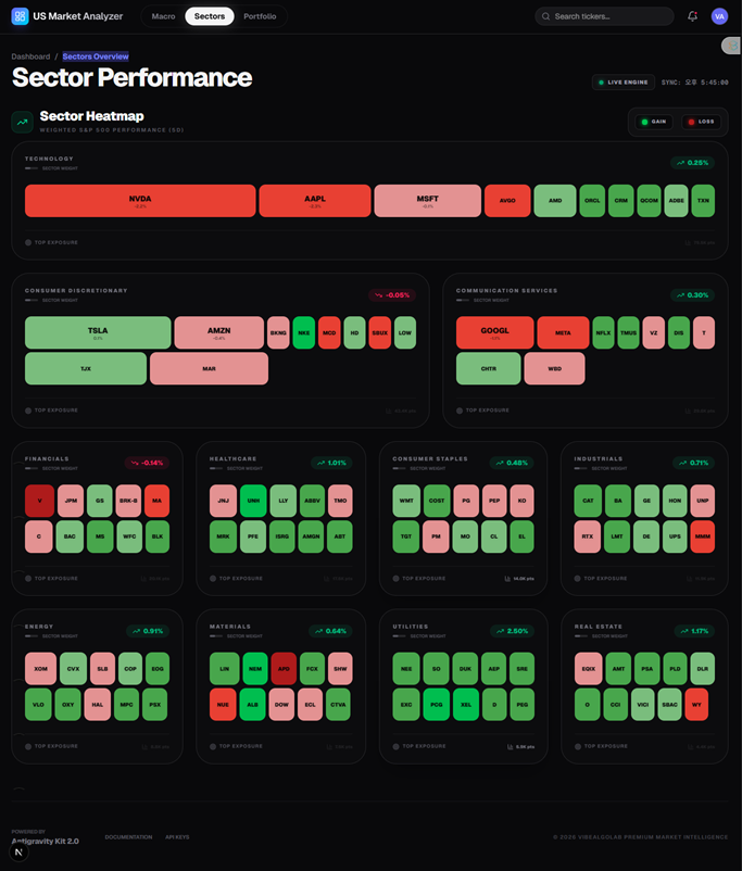
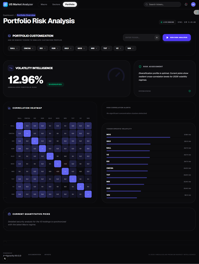
Through Vibe Coding, I didn’t need to manually calculate CSS grid spans or SVG path animations. I directed the AI: “Render a correlation matrix where saturation equals directional strength.” The AI handled the math; I handled the Strategic Requirement.
4. Engineering the Terminal: Next.js + Tailwind
The architecture of the frontend is as critical as its look. We utilized Next.js 14 App Router for its blistering speed and Tailwind CSS for rapid design orchestration.
// [High-Performance Component Pattern]
export const SectorCard = ({ title, momentum }) => (
  <div className="p-8 rounded-[2.5rem] bg-zinc-900/40 border border-zinc-800/50 backdrop-blur-xl hover:shadow-[0_0_20px_-5px_rgba(99,102,241,0.2)] transition-all">
    <h3 className="text-xs font-black uppercase tracking-widest text-zinc-500">{title}</h3>
    <div className={`text-4xl font-black mt-2 ${momentum > 0 ? 'text-emerald-500' : 'text-rose-500'}`}>
      {momentum}%
    </div>
  </div>
);By enforcing a Component-First Vibe, we ensured that every element of the dashboard is reusable and easily scalable. If I want to add a new “Crypto Sentiment” widget, the AI already knows the design tokens and can generate it in seconds.
5. Conclusion: Beauty in Performance
A professional dashboard should feel “alive.” Subtle micro-animations and smooth transitions aren’t just for show; they provide feedback that the data pipeline is flowing. Vibe Coding allows us to achieve this level of “Polished Fintech UI” without having a dedicated design team.
6. Visual Engineering Resources
Learn how to implement the exact design system used in the US Market Analyzer. I’ve documented the color tokens, font hierarchies, and component architectures for your next project.
📥 Design & UI Strategy Kit (v1.0)
7. Next Strategic Phase: [Part 4: Defensive Orchestration](https://vibealgolab.com/en-vibe-coding-series-04-fortress-protocol-verification/)
Even the most beautiful UI is useless if the data is wrong. In the next part, we cover the most important aspect of Vibe Coding: The Fortress Protocol. We will look at how I verify AI code to ensure it’s safe for live financial environments.
⬅️ Previous Phase: Part 2
⚠️ Important Disclaimer
- Educational & Research Purpose: This documents the UI/UX design philosophy of a research project.
- No Financial Advice: Visualizations are for demonstration and do not constitute investment recommendations.
- Visual Accuracy: Always verify raw data figures before making financial decisions based on UI charts.
- Software Liability: VibeAlgoLab is not responsible for any losses resulting from technical errors or visual misinterpretation.
Directed by VibeAlgoLab | Powered by Gemini.